
Figure 3. The heatmap plot between group of psychological suboptimal health and healthy controls.
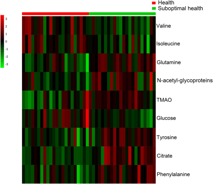
Red color indicates a higher level and green color indicates a lower level.
Official websites use .gov
A
.gov website belongs to an official
government organization in the United States.
Secure .gov websites use HTTPS
A lock (
) or https:// means you've safely
connected to the .gov website. Share sensitive
information only on official, secure websites.
Red color indicates a higher level and green color indicates a lower level.