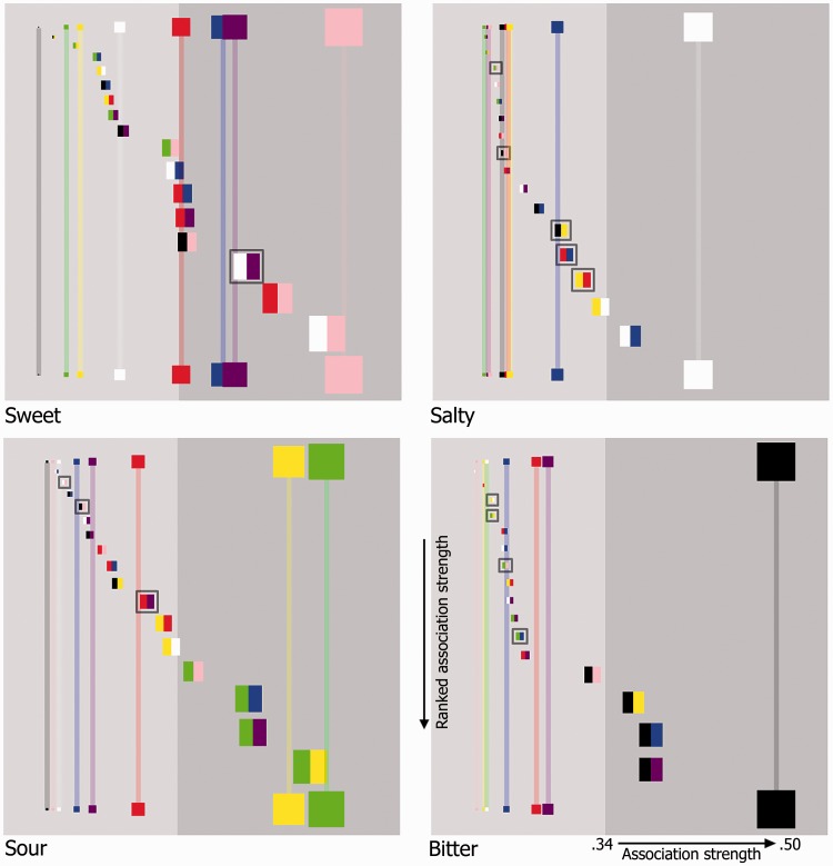
Figure 7.
Four color matrix plots as specified in Figure 6. Now, the horizontal position of each patch represents the strength of association (as well as the size of each patch) with rightward-positioned patches being more strongly associated than those on the left-hand side (the more participants selecting a given color for a given taste, the stronger the association; the horizontal axis being expressed as a ratio in terms of this value over the total number of participants). Single color patches were presented horizontally along the top and bottom of each plot. In terms of their vertical placement, double color patches have been arranged from the weakest association (top) to the strongest (bottom) in each plot. For illustrative purposes, double color patches that were more strongly associated with a given taste than each of their constituent colors have been encapsulated in a gray highlighting box. The background of each plot was colored light gray and dark gray, the latter signifying the region in which a particular taste was selected for patches by participants at a level that was significantly higher than expected by chance (p < .001; the experiment was simulated 100,000 times and the maximum number of consistent “by-chance” selections over all colors × tastes per virtual-experiment was used to determine this).

