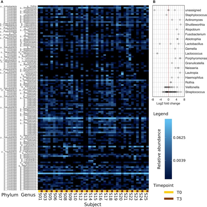
Figure 5.
Comparison of the abundances between T0 and T3. Data is derived from the 117 most abundant OTUs found in all samples. Panel (A) presents this data assigned to the respective genera with a relative abundance >2%. T0 and T3 of each subject are positioned next to each other (line below: T0, yellow; T3, brown). The color scaling is logarithmic. In (B), the log2 fold change calculated on the absolute abundances data of (A) is plotted. Seven OTUs were excluded as their average abundance in one of the points in time was equal to 0.

