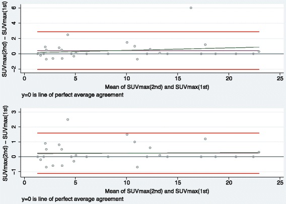
Fig. 2.

Bland-Altman plots for study 1 (upper panel: N = 30; lower panel: N = 29). Graphical display of the means against their respective paired differences, the Bland-Altman limits of agreement (red lines), the estimated mean difference (purple line), the reference line of perfect average agreement (line at y = 0), and the regression line according to the Bradley-Blackwood procedure (green line). In the lower panel, one outlier was excluded.
