Fig. 6.

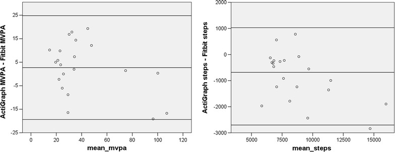
Bland–Altman plots for Cohort Three. The x-axis represents the mean of the ActiGraph and Fitbit values. The y-axis represents the mathematical difference between ActiGraph values and Fitbit values

Bland–Altman plots for Cohort Three. The x-axis represents the mean of the ActiGraph and Fitbit values. The y-axis represents the mathematical difference between ActiGraph values and Fitbit values