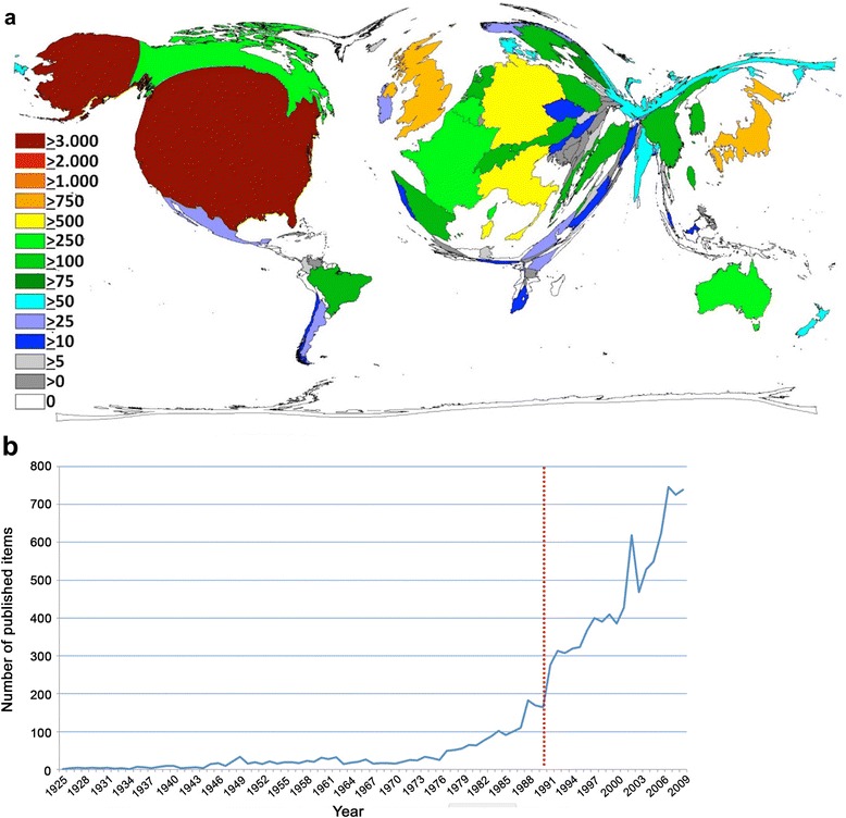
Fig. 1.

a Density-equalizing map of total endometriosis publications in each country. The area of each country was scaled in proportion to its total number of publications. Different colors encode numbers of endometriosis publications. This DEMP figure was generated by the authors as described in the methods section. b Chronological evolution of endometriosis-related publications. The red dotted line indicates the steep increase in publication activity visible after 1990
