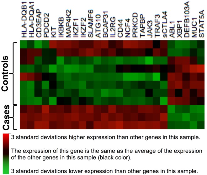
Fig 3. Heat Map of a Derivation Set, Comprised of Verified Cases and Inflamed Controls.
This heat map, built on agglomerative clustering with linkage by mean and a Euclidian distance metric, shows a comparison of log(2)-transformed normalized gene expression data from blood. Rows represent individual genes, the symbols of which are shown at right. Columns represent individual participants in our study. Colors represent the z-scores of the counts of mRNA molecules per 100 ng RNA in blood; red represents a high ratio of expression relative to other genes in that participant, and green represents a low ratio of expression relative to other genes in that participant. The left three columns are confirmed bacterial cellulitis cases, and have high expression of genes HLA-DQB1 through sCTLA4, and low expression of genes ABL1 through STAT5A. All of the other columns are inflamed controls, as defined in the text.

