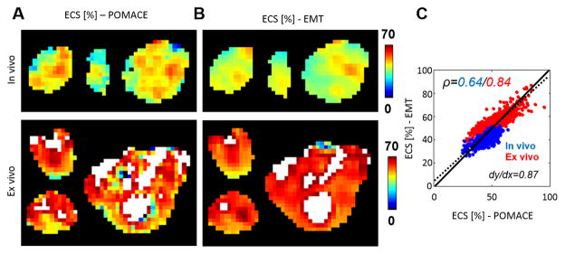
Figure 5. Comparison of ECS parametric maps.
derived from A. the POMACE (Eqs. [8]) and B. EMT applied to the PGSE data (Eq. [9]) in three representative tumors. Areas of high ECS (>70%) are highlighted in white. C. At voxel level, ECS measurements appear strongly correlated in vivo (ρ =0.64) and ex vivo (ρ =0.84). The complete dataset (in vivo + ex vivo) is best fitted via the dotted line (slope=0.87). The unity line is plotted for visualization purposes.

