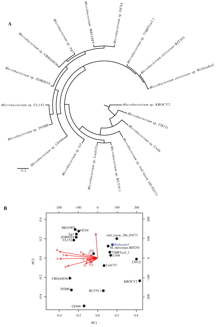
Fig. 3.
(A) COG profile clustering of the genomes compared in this study. (B) Principal component analysis biplot based on the genomic features and COG category distribution in the genomes compared. Genomes are represented by stars (strain names are shown). Strain Wellendorf is shown in blue. Arrows represent genomic features or COG categories used for comparison. The arrow directions follow the maximal abundance, and their lengths are proportional to the maximal rate of change between genomes. The first two components explained 75% of variation.

