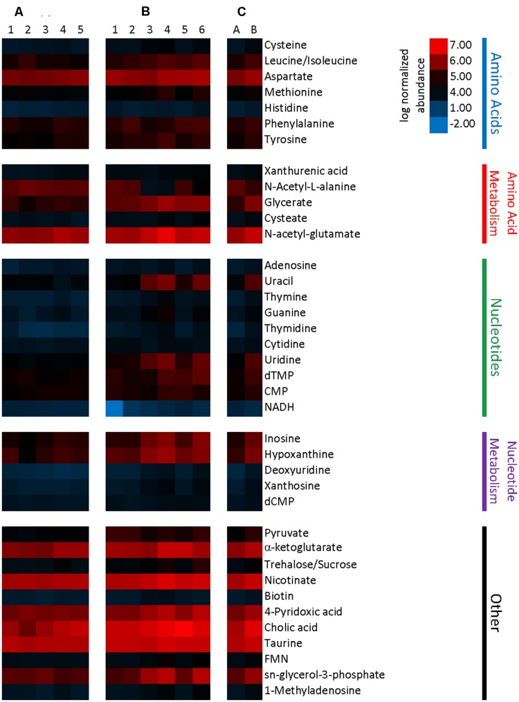
FIGURE 7.
Heatmap representing metabolite abundances normalized to sample tissue mass and log transformed. Metabolites displayed are significantly different with a p-value cutoff of 0.1. (A) Five columns represent metabolite abundances for each of five Taconic Biosciences mice. (B) Six columns represent each of the six Charles River mice. (C) Columns represent the mean abundances for Taconic (A) and Charles River (B).

