Figure S3.
Related to Figure 3 and STAR Methods
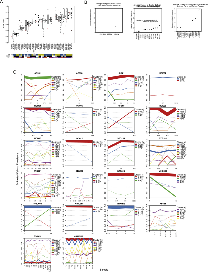
(A) Box plots of MATH scores for each model analyzed (n = 238 samples from 39 models). Each box plot represents the distribution of scores for matched tumor (red T), PDTXs and PDTCs.
(B) Plots of average change in clonal cluster prevalence. PyClone was used to infer clonal architecture for the set of samples from each PDTX model. For all PDTX models with more than two samples, the absolute change in clonal cluster prevalence was averaged over all clusters. Left plot: average change in clonal cluster prevalence with short-term culture of PDTX cells (n = 5 comparisons from 3 models). Middle plot: average change in clonal cluster prevalence with serial passaging (n = 38 passages from 12 models). Right plot: average change in clonal cluster prevalence with implantation (originating sample versus earliest PDTX passage; n = 24 pairs from 16 models). Dot size is proportional to number of samples analyzed.
(C) PyClone individual cluster plots showing clonal mean cellular prevalences for 22 models. Width lines are proportional to the number of variants in each clonal cluster. The legend indicates the name of the cluster and the number of variants in it. Asterisks remark clusters whose cellular frequencies are significantly different between samples. Only clusters with at least one variant are shown in the plot.

