
Figure 2.
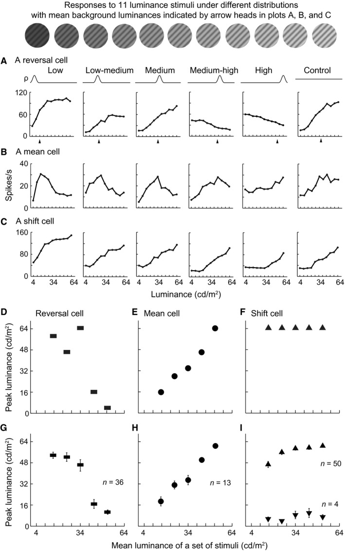
Dynamic responses to different luminance distributions in V1. (A–C) Examples of raw responses of reversal cells (A), mean cells (B), and shift cells (C) to six sets of luminance distributions in Figure 1B. All three cells were complex cells. ρ (probability) and curve represent a luminance distribution as in Figure 1 and correspond to the response curve elicited by the distribution. At the top, the 11 luminance stimuli from responses to which these luminance response function curves were extracted were shown. All stimulus sets contained the 11 stimuli in the study. (D–I) Relationship between the peak luminance (elicited the maximal response) of reversal cells (D, G), mean cells (E, H), and shift cells (F, I) and the mean luminance of stimulus distribution. The plots in (D), (E), and (F) were for the cells in (A), (B), and (C). The plots in (G), (H), and (I) were the averaged data for the populations of reversal cells, mean cells, and shift cells. In (H), linear regression, slope = 1.107, r = 0.988, P = 0.017. Note that 50 of the 54 shift cells preferred luminance increments (top of [I]), while 4 preferred decrements (bottom of [I]). Vertical bar: SEM.