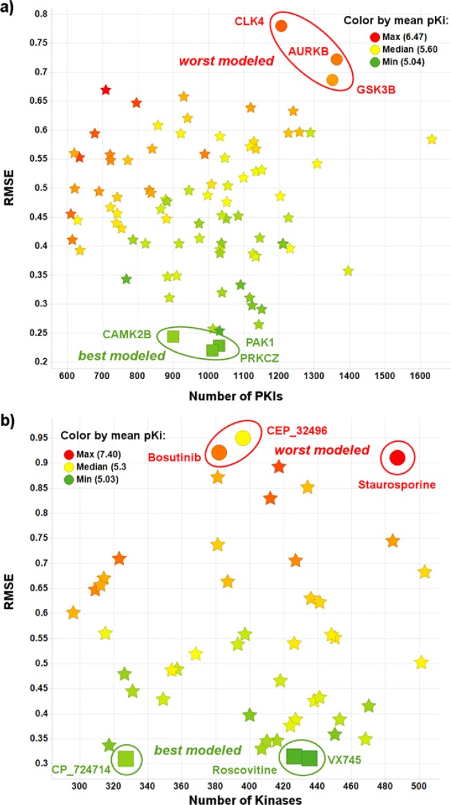
Figure 12.
(a) Average RMSE versus number of data points in the set grouped per PKI, for the Kinases with at least 600 PKIs tested with Ki results. (b) Average RMSE versus number of data points in the set grouped per Kinase, for the PKIs with at least 200 Kinases tested with Ki results. The color indicates the mean pKi across all Kinases/PKIs. The plots have been created on all models (different iterations of the learning curves) and give a good idea of the error distribution of our PCM models.

