Fig. 3.

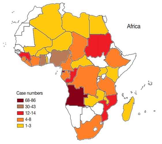
Geographical distributions of imported malaria cases from Africa, 2012-2014. A blank map of Africa was quoted from www.worldatlas.com. Color difference represents the level of imported malaria from different areas in Africa.

Geographical distributions of imported malaria cases from Africa, 2012-2014. A blank map of Africa was quoted from www.worldatlas.com. Color difference represents the level of imported malaria from different areas in Africa.