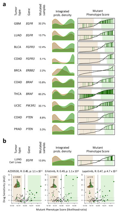
Figure 5. Mutant Phenotype Score and its association with drug sensitivity.
(a) Histograms showing the probability density for the non-mutated (salmon) and mutated (green) samples based on Mutant Phenotype Score (MPS) for 6 actionable mutations (complete list in Supplementary Fig. 12). Right plots show the MPS (y-axis) for all samples rank-sorted by MPS (x-axis) and indicate the mutated samples by green vertical lines. The MPS-defined WT and mutant phenotypes (likelihood-ratio > 3) are highlighted by the light-salmon and light-green boxes. (b) MPS analysis for EGFR on lung carcinoma cell lines. The scatter-plots show the drug sensitivity, quantified by the area under the titration curves (AUC), for EGFR targeting drugs as a function of MPS (expressed as likelihood-ratio). The cell lines resembling an EGFR mutated phenotype are included in the light-green box (likelihood-ratio > 3), while the ones resembling an EGFR WT phenotype are contained in the salmon box. Cell lines harboring non-silent mutations are indicated by dark-green dots. The solid and doted horizontal lines indicate the mean and 2.33 standard deviations over the mean of the chemoresistant cell lines, respectively. The association between drug sensitivity and MPS is shown on top of each plot by the Pearson’s correlation coefficient (R) and associated p-value. The violin plots (inserts) show the probability density for drug sensitivity (AUC) of the cell lines showing an EGFR WT (green) or mutant (brown) phenotype according to MPS. The horizontal line indicates the mean of each of the distributions, which were contrasted by Student t-test (p-value indicated in each insert).

