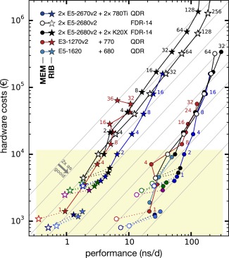
Figure 7.

Same representation as in Figure 6 (yellow box depicts section plotted there), now focusing on the parallel performance across multiple nodes (the small number next to the data points indicates the number of nodes used). The gray lines indicate perfect scaling and constant performance‐to‐price ratio, they are a factor of two apart each. A number next to a data point indicates how many compute nodes were used in that benchmark. [Color figure can be viewed in the online issue, which is available at wileyonlinelibrary.com.]
