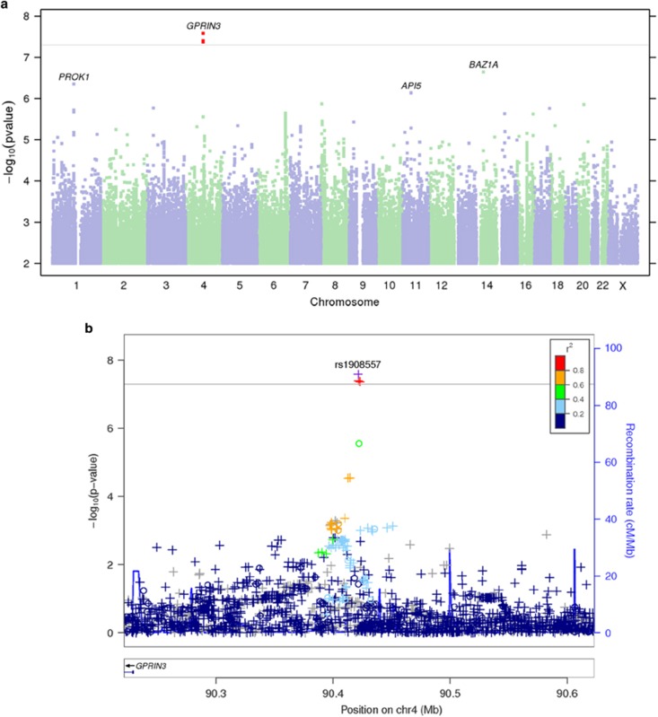
Figure 1.
Bupropion responders vs non-responders GWAS. (a) Manhattan plot—the Manhattan plot depicts the distribution of association test statistics versus genomic position, with chromosomes 1 to 22, X, and Y arranged along the x axis. The y axis represents log-scaled P-values. Positions with P<5 × 10⁻⁸ (a score of about 7.3) are shown in red. Loci with smallest P<10−6 are labeled with the name of the nearest gene. A ‘good' Manhattan plot should show towers of single-nucleotide polymorphisms (SNPs) with small P-values supporting most signals that pass the genome-wide threshold. (b) Regional association plots—the regional association plots show association test statistics versus position in the vicinity of the strongest associations. The plots are generated with LocusZoom,22 using linkage disequilibrium data from the March 2012 release of 1000 Genomes data. In the plots, a ‘o' symbol indicates a genotyped SNP and a ‘+' indicates an imputed SNP. Color indicates strength of linkage disequilibrium with the index SNP. GWAS, genome-wide association study.

