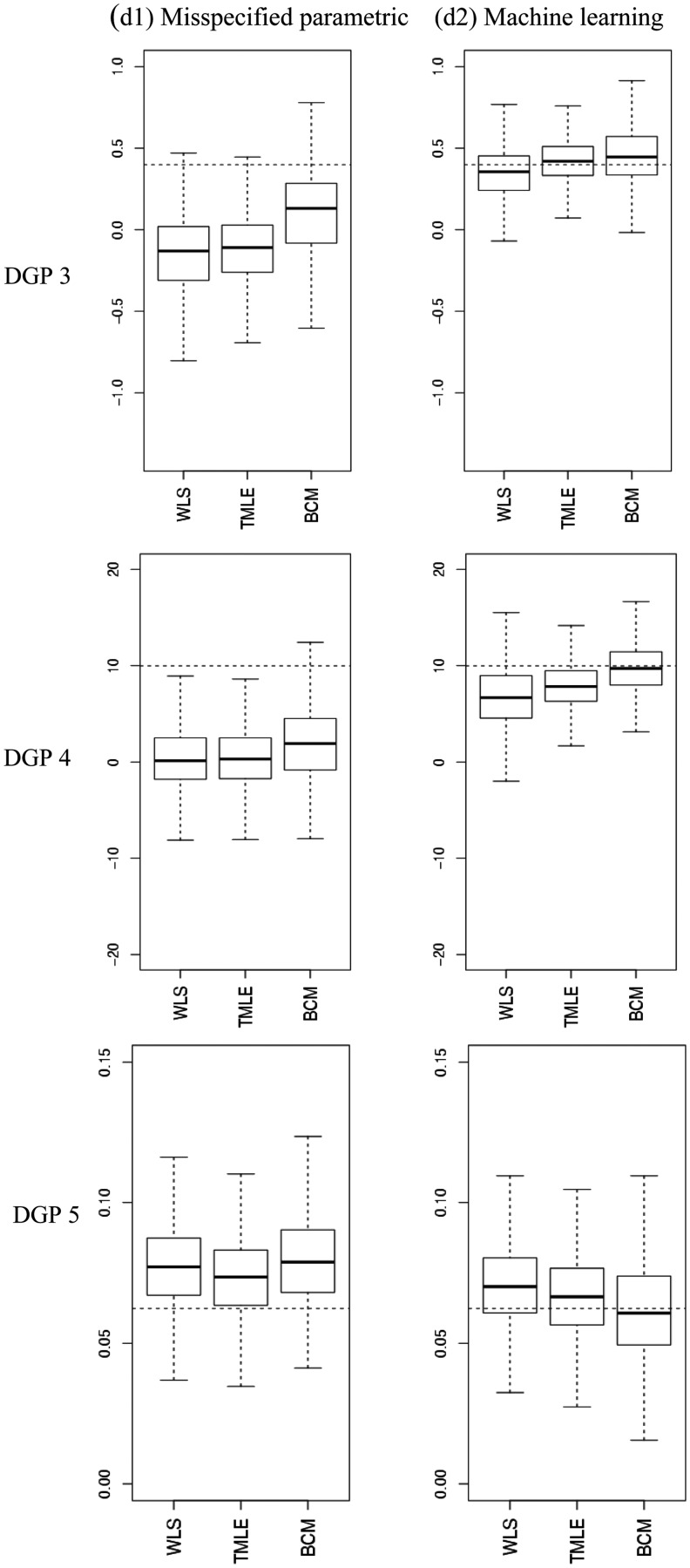
Figure 4.
Estimated ATEs in the simulations. The boxplots show bias and variation, as median, quartiles and 1.5 times interquartile range for the estimated ATEs across 1000 replications. The dashed lines are the true values. The left panel provides results for when the PS model and endpoint were estimated with misspecified fixed parametric methods (d1), the right panel for when machine learning estimation (d2) was used. (a) DGP 3, (b) DGP 4, (c) DGP 5.

