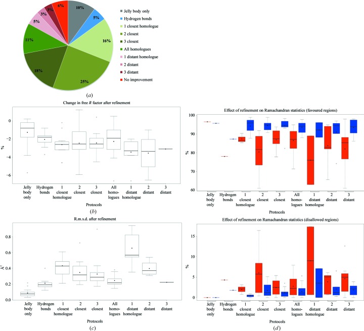
Figure 4.
Efficiency of the protocols implemented in the pipeline. (a) Pie chart illustrating how often each protocol performed best according to the Q-score. (b) Box plots illustrating the change in R free after refinement for each protocol. Data shown correspond to the structures for which the given protocol performed best. Analogous box plots show the change in global r.m.s.d. between atomic positions (c) and Ramachandran statistics (d) for the models before and after refinement. Values before refinement are shown in red and those after refinement in blue.

