Figure 1.

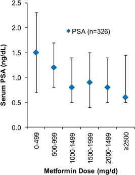
Distribution of PSA across metformin dose categories. The diamond represents median PSA at each dose threshold. The vertical bars represent interquartile ranges.

Distribution of PSA across metformin dose categories. The diamond represents median PSA at each dose threshold. The vertical bars represent interquartile ranges.