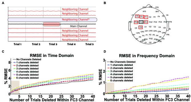
Figure 10.
User-defined threshold for selective interpolation. (A) The schematic illustrates the data array modification when a user tags a trial within a channel (highlighted in red) or a full channel (highlighted in blue) for removal in Steps 3 or 9. Tagged trials within a channel are interpolated while tagged channels are deleted. (B) The scalp map highlights the main channel selected for interpolation (FC3 in black) and its neighboring channels that could be deleted. In (C,D), x-axes represent the total number of trials interpolated within channel FC3 and y-axes represent the corresponding percent root mean square error (% RMSE). Legend is used to illustrate the total number of deleted neighboring channels. These two plots depict the error in data interpolation in the (C) time domain and (D) frequency domain. They illustrate a linear increase in interpolation error when an increasing number of trials are interpolated within FC3. Interpolation error also increases with the cumulative deletion of neighboring channels.

