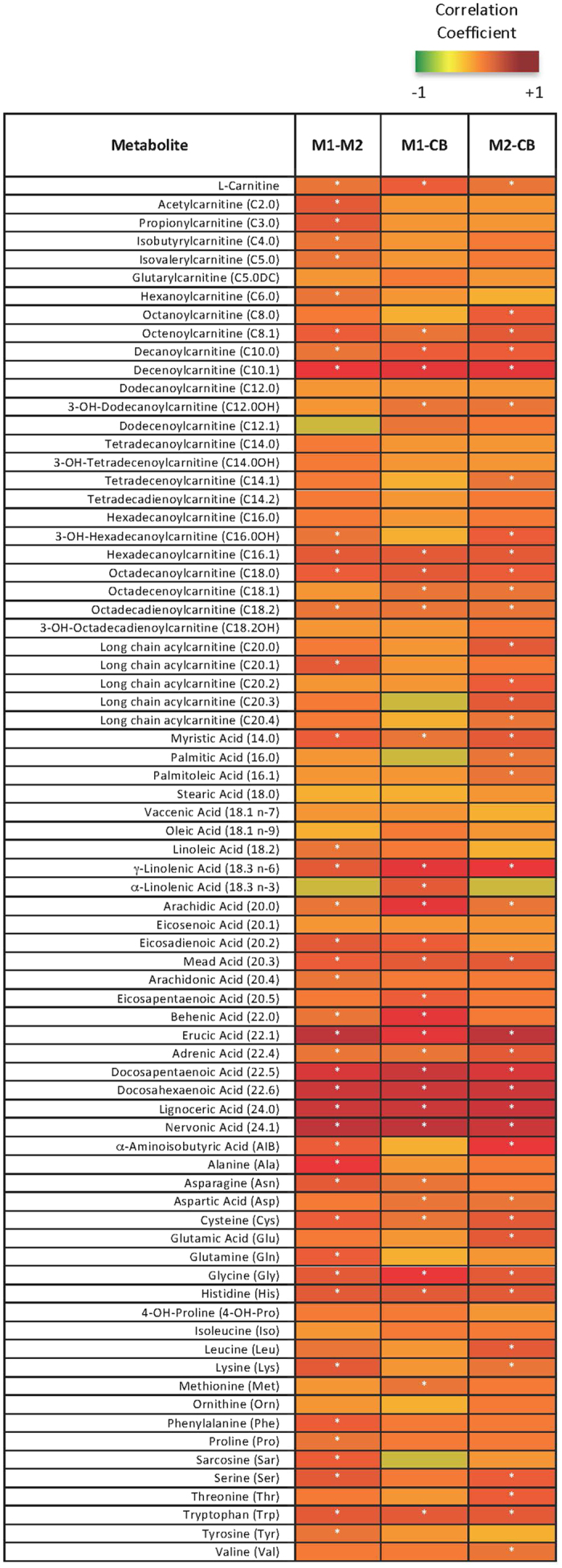
Figure 2. Significant Correlations between Maternal Metabolites at M1 and M2 and Infant Delivery Cord Blood (CB) Metabolites.

Pearson’s Correlations were performed on metabolite data and plotted into a heatmap. The darker red boxes indicate a larger positive correlation coefficient; smaller and negative coefficients are yellow to green. Significant correlations (adjusted p < 0.05) are denoted with a white asterisk.
