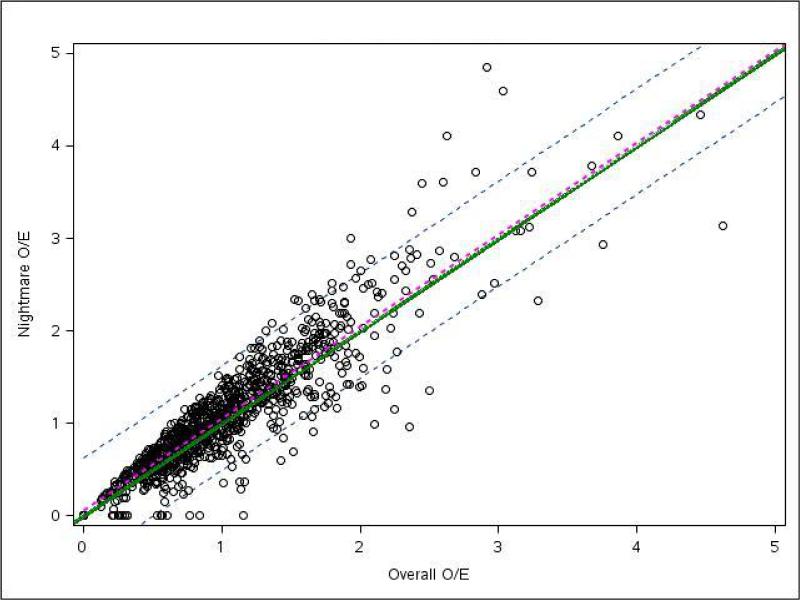
Fig 3.
Site observed to expected (O/E) mortality ratios for during “nightmare year” and overall study period. Each circle represents an individual site with its position representing that site's overall O/E for mortality (x axis) compared with its “nightmare year” O/E for mortality (y axis). The green line represents perfect correlation between overall and “nightmare year” O/E. Sites falling above the green line performed worse during their “nightmare year” compared with their overall cohort. Sites falling below the green line performed better during the “nightmare year.” The regression line (dotted magenta) and 95% confidence interval (dotted grey) for this plot indicate that centers, in general, had nearly identical O/E ratios during the “nightmare year” compared with the overall cohort.

