Figure 2.

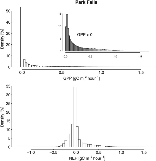
Histogram of hourly (top) GPP and (bottom) NEP at Park Falls (1997–2012). The y axis denotes the relative frequencies (in percent). The inset in the top shows histogram of all hourly GPP values greater than zero.

Histogram of hourly (top) GPP and (bottom) NEP at Park Falls (1997–2012). The y axis denotes the relative frequencies (in percent). The inset in the top shows histogram of all hourly GPP values greater than zero.