
Figure 3. Gene expression array analysis of ABCs, ASCs, MBCs and Naïve B cells.
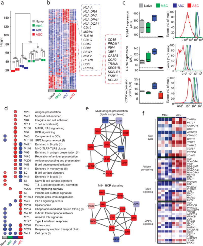
(a) Unsupervised cluster analysis using the top 15,000 probes with highest variance across all samples. Multiscale bootstrap resampling was used to calculate the “approximately unbiased” p-values for each branch (numbers in black, %). (b) Heat map of gene signatures of the four B cell subsets. Expression of genes (in rows), which were highly expressed in one subset is represented by the number of standard deviations above (red) or below (blue) the average value for that gene across all samples (in columns). Squares with dashed lines show selected genes highly expressed in ABCs (blue) and ASCs (red). (c) Box plots showing expression of MS4A1, TLR10 and CD52 in the four B cell subsets. Histogram plots showing surface protein expression of CD20, TLR10 and CD52 on the indicated B cell subsets. (d) GSEA analysis showing the Blood Transcription Modules whose expression activity is higher (red) or lower (blue) in one B cell subset compared to others (nominal p-value < 0.01, see methods). Circle size (“corrplot” R package) is proportional to the nominal enrichment score (NES). (e) Genes in BTMs M28 and M54; each ‘edge’ (gray line) represents a coexpression relationship, as described in 1 colors represent the mean Z score for ABC samples (red = higher and blue = lower expression on ABCs compared to others). (f) A heat map showing fold increase (red) or decrease (blue) in gene expression between the ABCs and MBCs for selected pathways.