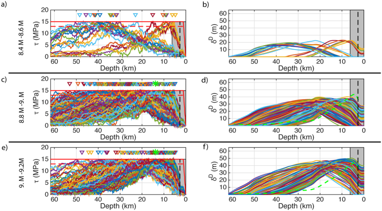
Figure 3. Individual pre-stress and resulting slip distributions from dynamic simulations.
(a,c,e) Display pre-stress distributions for selected earthquake magnitude bins 8.4–8.6, 8.8–9. and 9–9.2 respectively. The different coloured lines represent individual pre-stress distributions. The solid red line is the yield stress; the drop in yield stress due to the nucleation patches are not draw in order to improve clarity of the initial stress distribution; the amplitude of the drop in the yield stress in the nucleation zone is depicted by the dashed line. The triangles represent the location of the nucleation zones. The grey box represents the wedge with the dashed line marking the aseismic zone (i.e. low initial stress). In (b,d,f) the respective slip distributions to the corresponding pre-stress distributions on the left hand side are plotted. The different coloured lines represent individual slip distributions. In (c,e) the green star amongst the triangles represents the nucleation of the Tohoku M9 event50. In (d,f) the dashed green line (i.e. with a peak slip of 40 m inside the wedge) is a slip profile line taken for a slip inversion for the Tohoku M9 earthquake15.

