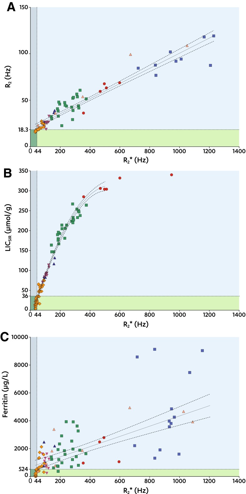
Fig. 4.
R
2, LICSIR, and ferritin against R
2*. A–C Scatter plots between R
2* (x-axes) and R
2, LICSIR, and serum ferritin (y-axes). Dotted lines at x = 44 and at y = 18.3 (A), y = 36 (B), and y = 524 (C) indicate the thresholds for R
2, LICSIR, and serum ferritin to identify increased R
2* (Table 4). Data points are grouped by SIR LIC type:  T1;
T1;  PD;
PD;  T2;
T2;  T2+;
T2+;  T2++;
T2++;  >350; and
  no LICSIR available. Regression results are shown by the solid lines with dotted 95% CI bands indicating the goodness of the fit. Shaded areas indicate true positive (
 ), true negative (
 ), false positive (
 ), and false negative (
 ), respectively

