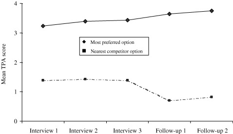
Figure 3.

Mean TPA scores for most preferred option and for its nearest competitor during the study. The figure illustrates that the mean TPA score for the most preferred option increased in a linear manner throughout the decision‐aid interview, and continued to do so after the actual decision was made. The figure also illustrates how the mean TPA score for the nearest competitor dropped in a step fashion between the end of the decision‐aid interview and follow‐up 1, when the treatment decision was made.
