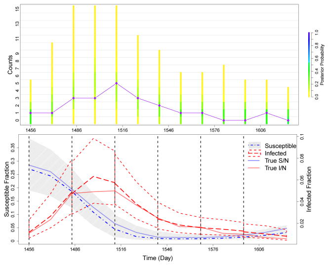
Fig 3.
Summary of prediction results for simulated data. We run PMMH algorithms on training sets of the data, which are cut off at each of the dashed black lines in the bottom plot. Cut off times occur at days 1456, 1484, 1512, 1540, 1568, and 1596. Future cases are then predicted until the next cut off. The top plot compares the posterior probability of the predicted counts to the test data (diamonds connected by straight purple lines). The coloring of the bars is determined by the frequency of each set of counts in the predicted data for each time point. The bottom plot shows how the trajectory of the predicted hidden states changes over the course of the epidemic. The gray area and the dot-and-dash line denote the 95% quantiles and median, respectively, of the predictive distribution for the fraction of susceptibles. The short dashed lines and the long dashed line denote the 95% quantiles and median, respectively, of the predictive distribution for the fraction of infected individuals. The solid blue and red lines denote the true simulated fraction of susceptible and infected individuals.

