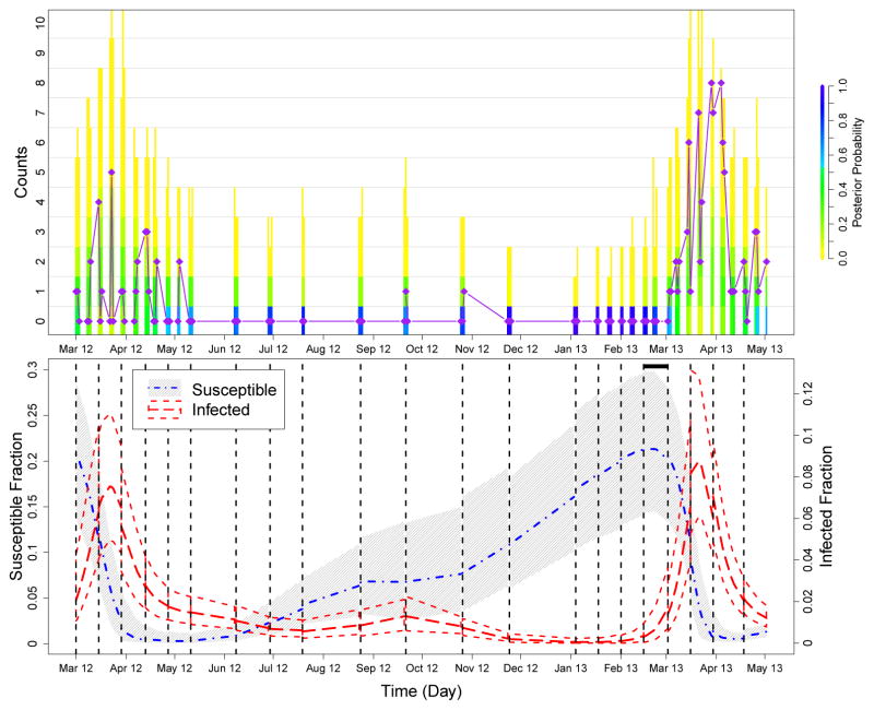
Fig 5.
Summary of prediction results for the second to last and last epidemic peaks in the Bangladesh data. We again run PMMH algorithms on training sets of the data, which are cut off at each of the dashed black lines in the bottom plot, and future cases are predicted until the next cut off. The top plot compares the posterior probability of the predicted counts to the test data (purple diamonds and line), and the bottom plot shows how the trajectory of the predicted hidden states changes over the course of the epidemic. See the caption of Figure 3 for more details. The black horizontal bar at the top of the bottom plot marks where our model predicts an increase in the fraction of infected individuals, warning of the upcoming epidemic. This increase is predicted weeks before an increase can be seen in the case counts.

