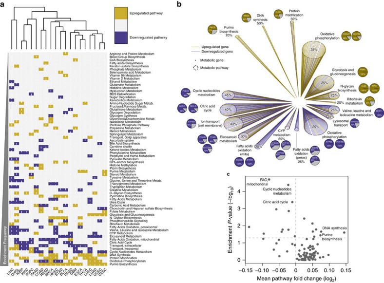
Figure 1. Rewiring of metabolic gene expression in cancer tissues compared to normal.
(a) Heatmap representation and hierarchical clustering of enriched upregulated (gold) and enriched downregulated (blue) metabolic pathways in cancers compared to normal tissues. (b) Gene expression effect plot of metabolic pathways enriched in more than 25% of cancers. Circles indicate metabolic pathways and dots in each circle represent individual metabolic genes. Gold and blue lines indicate upregulated and downregulated genes in cancers compared to normal tissues, respectively. Pie charts represent the most frequently up- or downregulated genes in the corresponding pathway; percentage values indicate frequency of up- or downregulation. (c) Volcano plot representation of mean fold change expression of genes in each pathway (x axis) vs enrichment P-values (y axis) in breast cancer vs normal samples (data obtained from Terunuma et al.8). Significantly enriched metabolic pathways in common with Fig. 1b are indicated.

