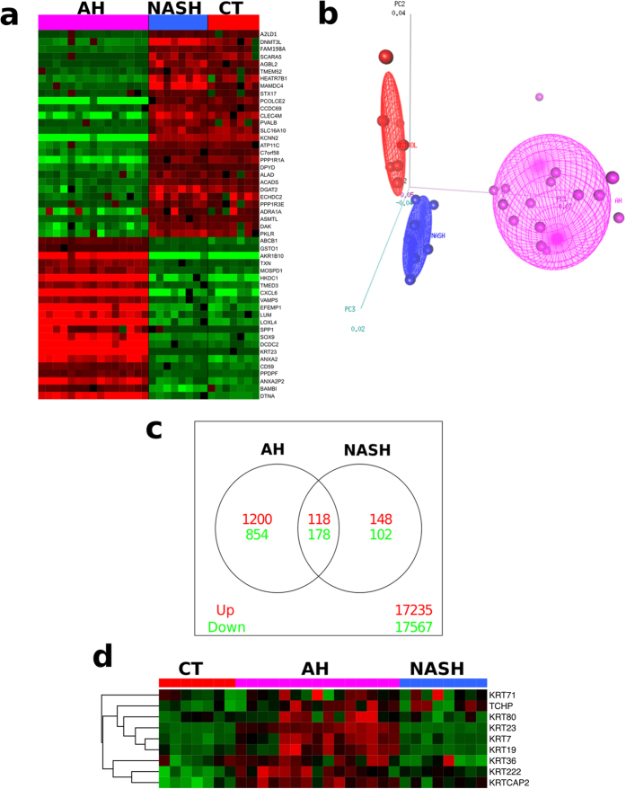
Figure 1. Comparative Functional Analysis of the Transcriptome in AH and NASH.
(a) Heatmap display of the genes with the most significantly different expression between patients with AH, patients with NASH and healthy controls. Rows represent genes, and columns represent samples. The intensity of each color denotes the standardized ratio between each value and the average expression of each gene across all samples. Red pixels correspond to an increased abundance of mRNA in the indicated liver biopsy sample, whereas green pixels indicate decreased mRNA levels. (b) Multidimensional scaling analysis representing the 30 samples that underwent array profiling. The different samples are placed in the three-dimensional space according to their mRNA expression. AH samples are represented in magenta, NASH in light blue and normal livers in red. (c) Venn diagram showing the overlapping genes that were significantly upregulated (red) or downregulated (green). Venn diagram shows genes specifically upregulated (1200 genes) or downregulated (854 genes) in AH as well as genes specifically upregulated (148 genes) or downregulated (102 genes) in NASH. (d) Heatmap display of keratins with the most significantly different expression between AH and NASH and control livers. The intensity of each color denotes the standardized ratio between each value and the average expression of each gene across all samples. Red pixels correspond to an increased abundance of mRNA in the indicated liver biopsy sample, whereas green pixels indicate decreased mRNA levels.

