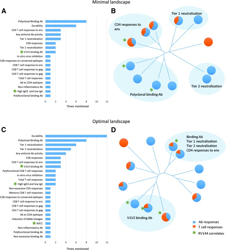
FIG. 1.
Immune landscape of candidates based on the minimal (A, B) or the optimal (C, D) desired immune responses. (A, C) show frequency distribution of immune responses identified as desired for the surveyed vaccine candidates. The numbers represent the number of candidates for which a particular response was mentioned. Green stars indicate immune responses that have been previously identified as correlates of risk in the RV144 data analysis. Long-tailed distribution on both graphs reflects that a majority of immune responses were listed for only one or two vaccine candidates. (B, D) show neighbor-joining trees of vaccine candidates based on the pair-wise distances between candidates as calculated using Canberra distance (6). The pie charts reflect the percentages of humoral and cellular immune responses for each candidate. Blue shaded areas highlight groups of candidates that have indicated immune responses in common with each other and distinct from the rest. Green stars indicate candidates that have among their immune targets at least one immune responses identified as a correlate of risk in the RV144 data analysis. Candidates from the RV144 follow-up program (P5) have not been included in the survey.

