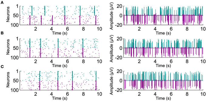
Figure 3.
Exemplary raster plots with the increasing connectivity. Left-hand panels show individual spike activity of 100 neurons for 10 s. Spikes from the two different populations are shown with different colors. Right-hand panels show the artificial recordings calculated from the corresponding population spike activity. The artificial recordings are shown for (A) 0%, (B) 50%, and (C) 100% neuronal connectivity.

