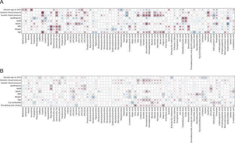
Fig 1.
Plot showing correlation between health survey data and metabolite levels for A) controls and B) pre-symptomatic individuals, the color and size of the circles correspond to the strength of the correlation, with increasing circle size and color intensity indicating increasing correlation; shades of blue are used for negative correlations and shades of red for positive correlations, squares indicate correlations that were statistically significant (p-value < 0.05).

