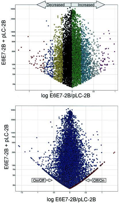
FIG. 2.
Scatter plot of a representative graph of the log ratio of experimental (E6/E7-2B)/control(pLC-2B) plotted against the sum of experimental E6/E7-2B and pLC-2B. (Top) Only genes in the increased/decreased categories are shown. (Bottom) Off/on and on/off genes are also shown and appear as arms of the graph. In each graph, every point represents an individual transcript. Each color stripe to the left or right of 0 represents >1, 1, 2, and 3 standard deviations from the mean.

