
Fig. 3.
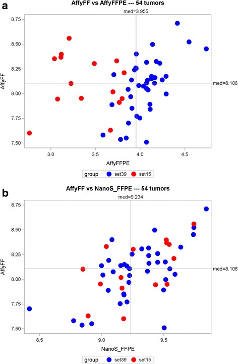
Scatterplots of the Affymetrix FF vs. Affymetrix FFPE (a) and NanoString FFPE (b) mean scores for the 54 samples. The red circles represent the 15 samples with “poor” RNA quality
Official websites use .gov
A
.gov website belongs to an official
government organization in the United States.
Secure .gov websites use HTTPS
A lock (
) or https:// means you've safely
connected to the .gov website. Share sensitive
information only on official, secure websites.
Scatterplots of the Affymetrix FF vs. Affymetrix FFPE (a) and NanoString FFPE (b) mean scores for the 54 samples. The red circles represent the 15 samples with “poor” RNA quality