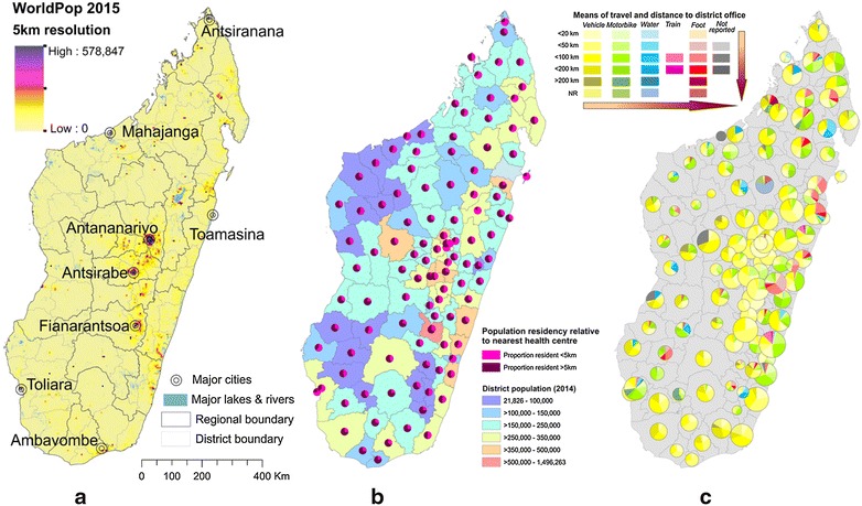
Fig. 5.

District-level summaries of health centre accessibility, a population density in 2015; b health centre accessibility to catchment populations and b health centre accessibility to the health district headquarters where monthly data must be reported. a Maps population density in 2015 (WorldPop [63]) together with cities estimated to have populations >100,000). b Shows the proportion of the population resident more than 5 km from their nearest health facility (equivalent to further than approximately one h walk). The underlying colour indicates the total population resident in the district, while the pie charts show the proportion of the population per district resident further or closer than 5 km from their nearest health facility. This is based off a subset of 2690 health facilities (69 % of all health facilities) for which data were available. c Maps pie charts representing different categories of accessibility for each health centre per district. Colours represent the available mode of transport, while colour intensity indicates distance categories between health centres and the health district headquarters. Pie chart sizes indicate the number of health centres needing to report data per district (range: 3–55). Arrows indicate the increasing difficulty with reporting. Data from the NMCP (Fig. 5b) and the Malagasy Health Sector Development Plan for 2014-2019 [64] (Fig. 5c)
