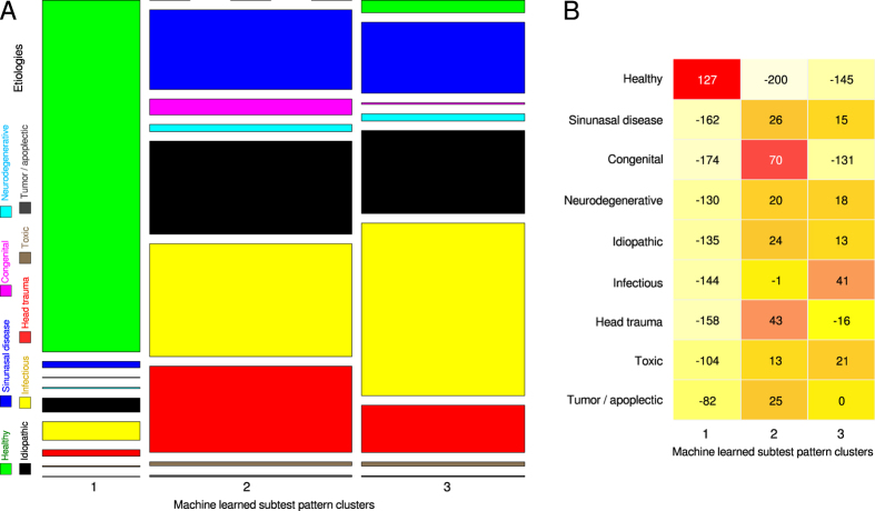
Figure 4. Summary plot of the associations of clusters with etiologies of olfactory (dys)function.
(A) Mosaic plot representing a contingency table of the etiologies suspected to be associated with the subjects’ olfactory function versus the machine-learned clusters of olfactory subtest results. The size of the cells as proportional to the number of subjects included; the color code is similar to that used in Fig. 3 middle. (B) The same contingency table was assessed for overrepresentation of etiologies among machine-learned clusters, which was analyzed using the relative differences of observed and expected observations32. In the matrix plot, the cells are equally sized and display the relative differences; the color code ranges from light yellow indicating underrepresentation to red indicating overrepresentation. The figure has been created using the R software package (version 3.2.3 for Linux; http://CRAN.R-project.org/22). Specifically, the plots were been drawn using the using the “mosaicplot” (left) or “heatmap.2” (right) functions, the latter being part of the R package “gplots” (Warnes G. R.; https://cran.r-project.org/web/packages/gplots/index.html); with the build-in clustering of the plotting routine disabled (R switches “Colv = FALSE, Rowv = FALSE”).

