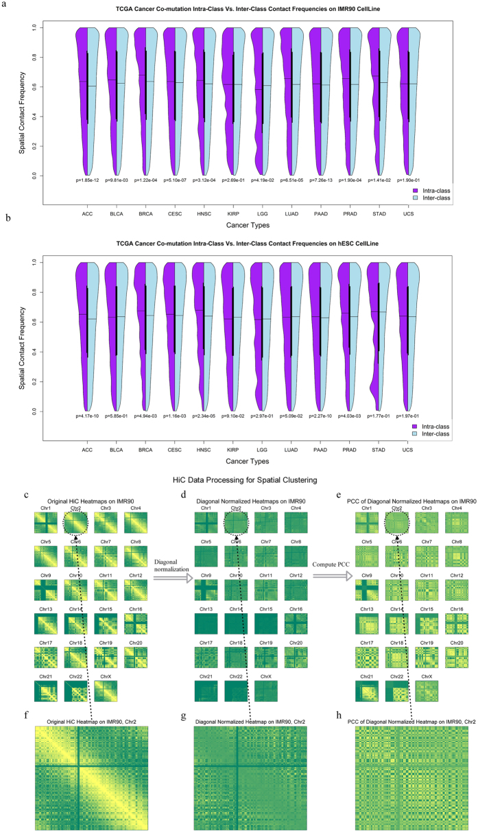
Figure 2. Spatial proximities of co-mutated gene clusters & Hi-C data processing.
Comparison of intra- and inter-class contact frequency distributions. (a) The results of the 12 TCGA cancers, based on IMR90 Hi-C data. The left part (purple) of each violin plot is the intra-class contact frequency distribution. The right part (sky blue) of each violin plot is the inter-class contact frequency distribution (b) The results of the 12 TCGA cancers, based on hESC Hi-C data. (c) The original heatmaps of each chromosome were grouped based on the IMR90 Hi-C dataset and were then diagonally normalised for each chromosome (d). (e) The Pearson correlation coefficient (PCC) matrices were taken on the diagonal-normalised Hi-C heatmaps. (f–h) The zoomed-in matrices on chromosome 2 are shown as an example. We further overlapped these matrices with the co-mutated genes identified by TCGA/COSMIC datasets in sample matrices.

