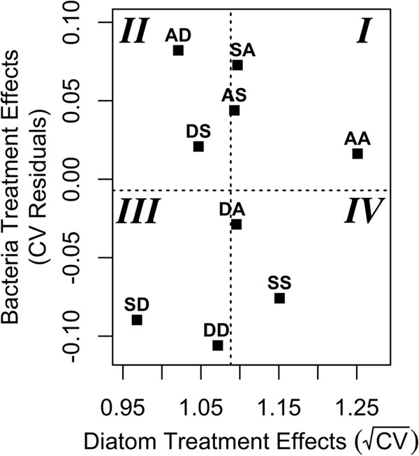
FIG 3 .

The plot shows the average variability of each treatment in the diatom and bacterial communities, as obtained from the mixed models. The dashed lines show the overall mean responses for the diatom and the bacterial treatments, such that treatments with a value higher than the mean are comparatively more variable. The AA treatment falls in the most variable portion of the plot (quadrant I), whereas the two communities that were least variable (quadrant III) were disturbed twice.
