
Figure 2.
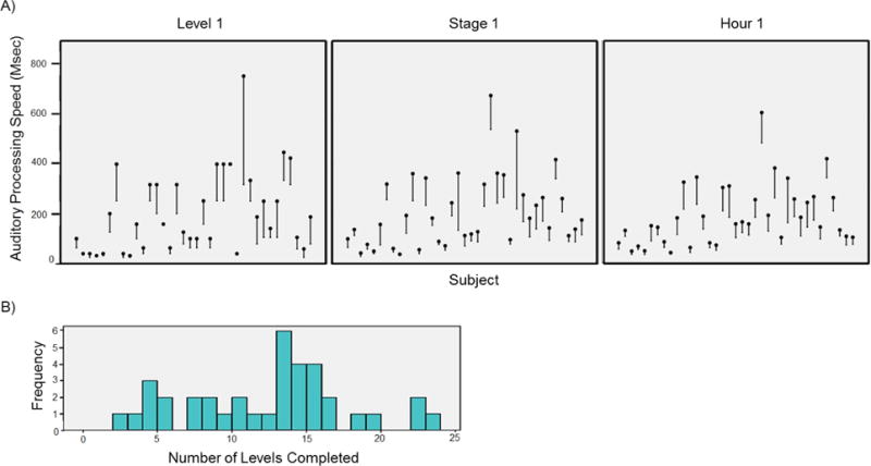
Data from each investigational ATCT performance metric. A) Performance improvement trajectories for each participant during Level 1, Stage 1, and Hour 1. Black dots represent baseline auditory processing speed (APS) and lines represent APS improvement trajectories. Lower score indicates better performance. B) Histogram of the number of training levels completed by participants during the one-hour training session.