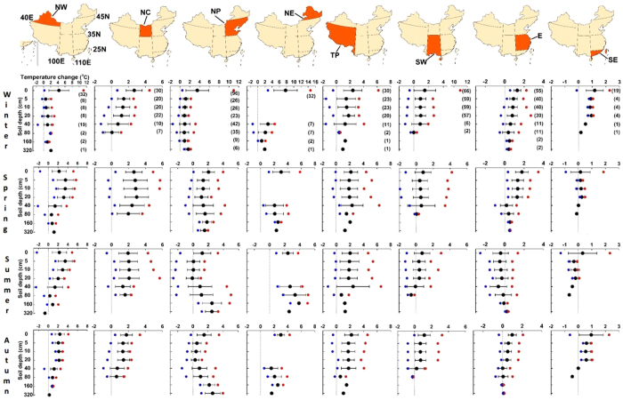
Figure 3. Regional and seasonal patterns of soil temperature change in various soil layers during 1962–2011 in China.
The number in brackets is the number of stations where data were used for the calculation in that layer, with black, red, and blue symbols depicting average, maximum, and minimum changes, respectively. Error bars are ±1 SD. The grey line indicates the zero change line. Maps in this figure were generated though the ArcGIS 9.3 software provided Environmental Systems Research Institute (http://www.esri.com).

