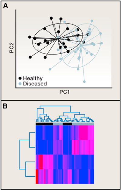
Figure 3. Principal Coordinates Analysis and Classification Methods.

(A) Principal coordinates (PCs) from a principal coordinates analysis (PCoA) are plotted against each other to summarize the microbial community compositional differences between samples. Each point represents a single sample, and the distance between points represents how compositionally different the samples are from one another. The points are colored by health state, showing a clear difference in the microbial community composition between diseased (green) and healthy (purple).
(B) Classification methods can be used to determine which OTUs discriminate between the healthy and diseased groups, and a heatmap can be used to visualize over/under representation of these OTUs in the groups. In this example, the abundances of the four discriminatory OTUs (rows) are colored from low abundance (blue) to high abundance (red) in the 47 samples (columns). Both the PCoA plot and the sample dendrogram in the heatmap show that the separation between disease and health states is not perfect. There is some overlap in the composition of these samples, though the placement of points in the PCoA plot is far from random. This observation should be supported with statistical analysis. For example, a Monte Carlo two-sample t test, comparing the distribution of within-group distances to the distribution of between-group distances applied to these data tells us that this clustering pattern is statistically significant.
