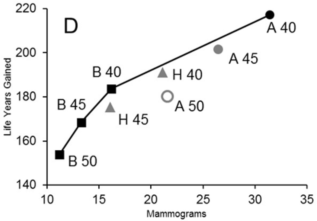
Figure 1. Efficiency Frontier for Harms (Average Number of Screening Examinations) and Benefits (Life Years Gained) for Exemplar Model by Screening Strategy.
The panel shows an efficiency frontier graph for an exemplar model (model D); comparable graphs are included on Appendix Figure 2 for all 6 models.
The graph plots the average number of mammograms per 1,000 women against the life-years gained for each screening strategy (vs. no screening). We plot efficient strategies (i.e., those in which increases in mammography use results in greater life-years gained than the next least-intensive strategy). The line between strategies represents the “efficiency frontier.” Strategies on this line would be considered efficient because they achieve the greatest gain per mammography used compared with the point (or strategy) immediately below it. Points that fall below the line are not as efficient as those on the line. When the slope in the efficiency frontier plot levels off, the additional life-years gained per increase in mammography are small relative to the previous strategies and could indicate a point at which additional screening might be considered as having a low return (benefit).
Black strategies are efficient; dark grey strategies are close to the efficiency frontier; and light grey strategies are dominated (inefficient). Biennial strategies are indicated with a square; hybrid strategies (annual in the 40’s, followed by biennial from 50–74) are represented by a triangle, and annual strategies with a circle. Efficiency frontiers for other harm and benefit metrics can be found at: (34)

