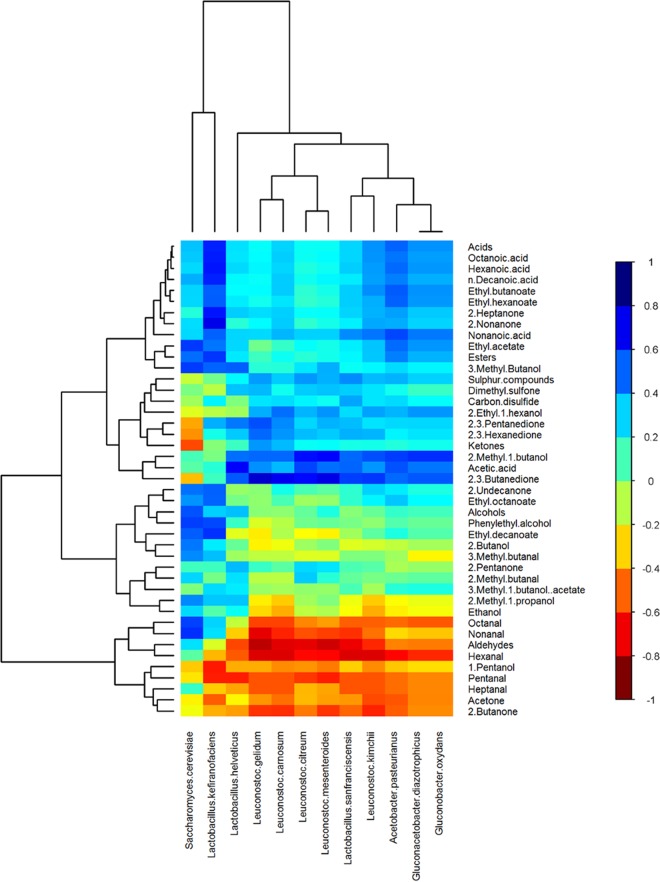
FIG 5 .
Hierarchically clustered heat map showing correlations between the relative abundances of microbial species and the levels of volatile compounds in kefir samples. Clustering was performed with the hclust function in the R package gplots. The color of each tile of the heat map indicates the type/strength of the correlation for a given species-compound combination, as indicated by the color key.

