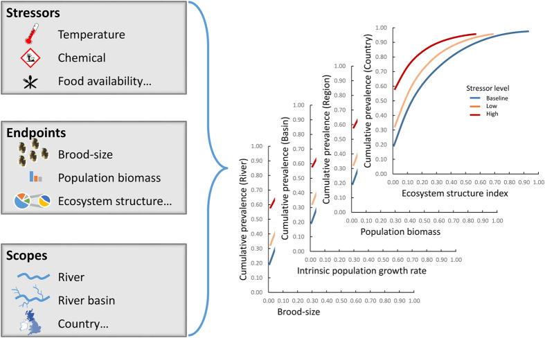
Figure 1. Prevalence plots.
The prevalence plot present an endpoint (e.g. brood-size, population biomass; see Fig. 3) or an effect size (e.g. loss of biomass, index relative to the population structure; see Fig. 4) as a function of a cumulative prevalence for this effect (e.g. proportion of a river, hydrogeographic basin) for a selected stress level (e.g. chemical stress, temperature stress). The map was created using GIMP 2.8.14 (www.gimp.org).

