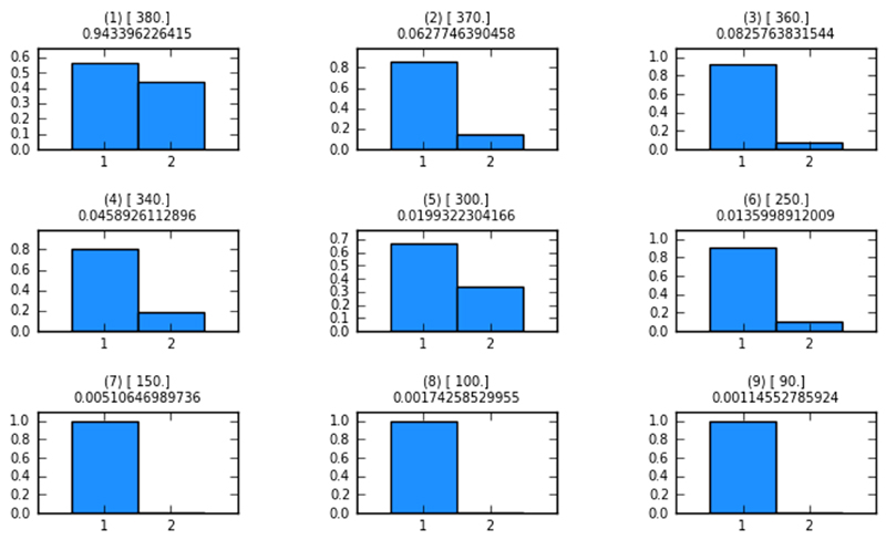
Figure 5. Model probabilities after each ABC-SMC population.
Each of the histograms in this figure is produced after each ABC-SMC population. Shown are the model probabilities as barplots. The numbers in () represent the population number; numbers in [] are the distance thresholds for each population (epsilon-schedule); numbers below the above-mentioned parentheticals are the acceptance rates. In population 1 both models have approximately the same probability of representing the data. After population 16 model 1 has a much higher probability of representing the data best.

