
Figure 1.
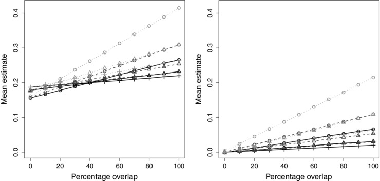
Mean two‐stage least squares/inverse‐variance weighted estimates plotted against sample overlap for different values of instrument strength (, circle; , triangle; , plus) and different values of the confounder effect on the outcome (, black solid line; , mid‐gray dashed line; , light‐gray dotted line). Left panel: positive causal effect (); right panel: null causal effect ()