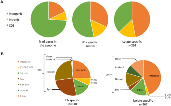
Figure 3. Comparative analysis of mutation frequency among B. microti isolates.
(A) Pie charts illustrating the mutation frequency in coding sequences (CDS), introns and intergenic regions as a percentage of total base pairs in the genome (left) and as a percentage of all mutations found to be specific to R1 (middle) or found in other isolates but not R1 (right). (B) Pie charts illustrating the details of the mutation frequency in genes in R1 (left) and other isolates (right).

